Tutorial 2: demonstrate t-tests with LikertMakeR
Hume Winzar
Source:vignettes/blog_02.Rmd
blog_02.RmdTL;DR
What this tutorial does:
Takes published summary statistics (means, SDs, n, α) from You, et al. (2025).
Uses
LikertMakeR::lfast()to generate synthetic Likert-scale data that matches those properties.Combines groups into a tidy data frame.
Runs a standard independent-samples t-test in base R.
Verifies that the synthetic t-value closely reproduces the published result.
Computes and interprets multiple effect sizes (Cohen’s d, probability of superiority, WMW odds).
Visualizes the group differences using dotplots and ggstatsplot.
In short: you can recreate realistic Likert-scale datasets from reported summary statistics and use them to teach or demonstrate inferential statistics.
Introduction: comparing two or more groups
In social research, we often compare groups on a survey-based construct. Typically, this involves testing whether two (or more) groups differ on the mean of a Likert-scale measure.
In this tutorial, we will:
Recreate published summary statistics using LikertMakeR.
Generate synthetic Likert-scale data that match those statistics.
Conduct an independent-samples t-test in base R.
Interpret the result using multiple effect size measures.
The goal is simple: *to show how reported means, standard deviations, and sample sizes are sufficient to reconstruct realistic data for demonstration and teaching purposes.**
“Reproducing” Data from a Published Study
To make this concrete, we will reproduce results from You, et al. (2025), who studied whether a creative-thinking prompt increases cognitive flexibility.
They measured cognitive flexibility using a three-item, 7-point Likert scale (α = 0.85) and compared:
- A creative prompt group
- A control group
| condition | mean | sd | n | t | Cohen’s d |
|---|---|---|---|---|---|
| creative | 5.31 | 1.31 | 145 | 5.06 (p<0.001) | 0.59 |
| control | 4.44 | 1.62 | 149 |
Generate the data
We do not need to create the three individual items in the “cognitive_flexibility” scale. We only need to estimate their aggregate values: the mean of those three items (questions), as described in the above table.
For most analyses we want a data frame in ‘Tidy’ format using the parameters reported in You et al.. So we want two variables:
- treatment (creative-prompt, control) and
-
cognitive_flexibility (a value between
1and7in increments of1/3)
{
  library(LikertMakeR)

  # creative group
  creative <- data.frame(
    treatment = "creative",
    cognitive_flexibility = lfast(
      n = 145,
      mean = 5.31,
      sd = 1.31,
      lowerbound = 1,
      upperbound = 7,
      items = 3
    )
  )
  # control group
  control <- data.frame(
    treatment = "control",
    cognitive_flexibility = lfast(
      n = 149,
      mean = 4.44,
      sd = 1.62,
      lowerbound = 1,
      upperbound = 7,
      items = 3
    )
  )
  # join the groups
  df <- rbind(creative, control)
}
Review the generated data
The data structure should show two variables:
- treatment, (character)
- cognitive_flexibility, (numeric)
# data structure
str(df)
## 'data.frame': 294 obs. of 2 variables:
## $ treatment : chr "creative" "creative" "creative" "creative" ...
## $ cognitive_flexibility: num 7 6.67 5 4.67 6 ...Printing the data shows all observations
##     treatment cognitive_flexibility
## 1    creative                     7
## 2    creative      6.66666666666667
## 3    creative                     5
## 4    creative      4.66666666666667
## 5    creative                     6
## 6    creative      5.33333333333333
## 7         ...                   ...
## 8         ...                   ...
## 289   control      2.66666666666667
## 290   control      5.66666666666667
## 291   control                     5
## 292   control      5.33333333333333
## 293   control                     2
## 294   control      4.33333333333333
Means and standard deviations are the same as prescribed, to two decimal places.
# calculate sample moments
moments <- aggregate(. ~ treatment, df, function(x) c(mean = mean(x), sd = sd(x)))

print(moments)
## treatment cognitive_flexibility.mean cognitive_flexibility.sd
## 1 control 4.438479 1.619183
## 2 creative 5.310345 1.310367Visualise the data
There are many ways to visually compare two distributions - from candle-plot, to boxplot, to density plots, beeswarm and violin plots, to minimalist Tufte plots. With the exception of candle-plots, which are archaic and often misleading, all are acceptable for different purposes.
For now, let’s visualise the data with minimal judgement. How do the two distributions compare? We’ll use dot-plots.
library(ggplot2)

ggplot(
  data = df,
  aes(
    x = treatment,
    y = cognitive_flexibility,
    colour = treatment, fill = treatment, alpha = 0.25
  )
) +
  geom_dotplot(stackdir = "center", binaxis = "y") +
  scale_y_continuous(
    breaks = seq(1:7),
    limits = c(1 - 1 / 3, 7 + 1 / 3)
  ) +
  theme_classic() +
  theme(legend.position = "none")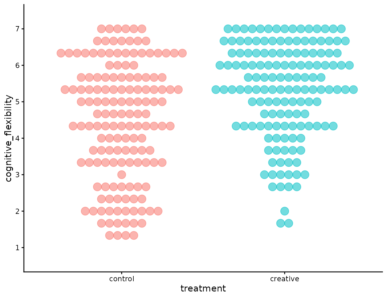
You et al. (2025) Study#1
We can see that there is quite a deal of overlap between the two distributions. Are they really different?
Typically we use a t-test. That why we’re here today.
t-test
We use the t.test() function from Base R.
t_synthetic <- t.test(cognitive_flexibility ~ treatment, data = df)

t_synthetic
##
## Welch Two Sample t-test
##
## data: cognitive_flexibility by treatment
## t = -5.0816, df = 282.66, p-value = 6.814e-07
## alternative hypothesis: true difference in means between group control and group creative is not equal to 0
## 95 percent confidence interval:
## -1.2095899 -0.5341422
## sample estimates:
## mean in group control mean in group creative
## 4.438479 5.310345The t-test result for our synthetic data is almost identical to that reported in You et al.. (tyou=5.06)
Hooray!
Side-rant
Consider that when William Sealy Gosset published his t-test in 1908 (Student, 1908), under the pseudonym, “Student”, he was interested in small-sample inference: samples of up to 10 observations. We have many more than that!
As sample-size increases, the standard error of the estimate decreases, and the resulting t-value increases. When we have samples with hundreds of observations it’s very likely that any estimate will be “statistically significant”
To think about whether the difference is large, we should consider effect size.
Effect size
With samples this large, statistical significance is almost guaranteed for moderate differences.
The t-test answers the question:
Is the difference unlikely to be zero?But that is rarely the most important question.
A more useful question is:
How large is the difference?To answer that, we examine three effect-size measures:
- Cohen’s d
- Probability of Superiority (Common Language Effect Size)
- Wilcoxon-Mann-Whitney odds ratio
library(effectsize)

# Cohen's d
cohens_d(cognitive_flexibility ~ treatment, data = df)
## Cohen's d | 95% CI
## --------------------------
## -0.59 | [-0.82, -0.36]
##
## - Estimated using pooled SD.
# common-language effect size (CLES)
# Probability of superiority
p_superiority(cognitive_flexibility ~ treatment, data = df)
## Pr(superiority) | 95% CI
## ------------------------------
## 0.34 | [0.28, 0.40]
# Wilcoxon-Mann-Whitney odds
wmw_odds(cognitive_flexibility ~ treatment, data = df)
## WMW Odds | 95% CI
## -----------------------
## 0.52 | [0.40, 0.68]
##
## - Non-parametric CLESCohen’s d
Cohen’s d is the standardized difference between two means. That is, it is the number of standard deviations that separate the two means. Hedge’s g is the small-sample bias-corrected version of d.
It expresses the group difference in standard deviation units.
Here, d = 0.59.
This means the creative group mean is 0.59 standard deviations higher than the control group mean — conventionally interpreted as a moderate effect.
Cohen’s d answers:
How far apart are the group means, relative to the variability in the data?Because our synthetic data were generated to match the published moments, the estimated d matches the original report exactly.
Probability of Superiority
Probability of Superiority reframes the effect in more intuitive terms.
It estimates:
The probability that a randomly selected individual from one group will score higher than a randomly selected individual from the other group.Here:
- P(creative>control)≈0.66
That is, there is a 66% chance that a randomly chosen participant from the creative condition will score higher than a randomly chosen participant from the control condition.
This interpretation is often more concrete than standardized mean differences.
Wilcoxon-Mann-Whitney odds
Wilcoxon-Mann-Whitney (WMW) odds ratio expresses the same dominance idea in odds form:
odds = p / (1 - p)
where p is the probability of superiority.
Here, the odds indicate that a member of the creative group is approximately 1.9 times more likely to score higher than a member of the control group.
Odds are not probabilities — they compare the likelihood of success to failure — but they communicate magnitude in a way similar to risk ratios.
What These Effect Sizes Tell Us
All three measures describe the same underlying phenomenon from different angles:
Cohen’s d → standardized distance between means
Probability of superiority → intuitive dominance probability
WMW odds → dominance expressed as a ratio
They confirm that the difference is not just statistically detectable — it is substantively meaningful.
In large samples, p-values become trivial. sizes carry the real interpretive weight.
visualise the data with more information
I’m going to use the extraordinary ggstatsplot package to produce summary statistics plus a combination of boxplots, dotplots, and violin plots.
library(ggplot2)

ggplot(
  data = df,
  aes(
    x = treatment,
    y = cognitive_flexibility
  )
) +
  geom_violin(
    fill = "grey85",
    colour = NA,
    width = 0.9,
    alpha = 0.6
  ) +
  geom_boxplot(
    width = 0.18,
    outlier.shape = NA,
    fill = "white",
    colour = "black",
    linewidth = 0.4
  ) +
  geom_jitter(
    width = 0.07,
    alpha = 0.25,
    size = 1,
    colour = "black"
  ) +
  stat_summary(
    fun = mean,
    geom = "point",
    shape = 21,
    size = 3,
    fill = "black",
    colour = "black"
  ) +
  scale_y_continuous(
    breaks = seq(1:7),
    limits = c(1 - 1 / 3, 7 + 1 / 3)
  ) +
  labs(
    title = "Distribution of cognitive flexibility scores",
    x = NULL,
    y = "Cognitive flexibility"
  ) +
  theme_classic(base_size = 12) +
  theme(
    legend.position = "none",
    plot.title = element_text(hjust = 0.5)
  )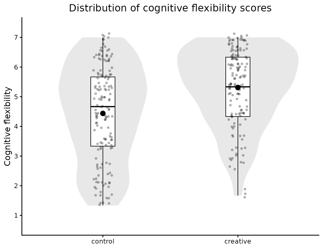
Reproduction of You et al. (2025) Study#1
The overlap between the two distributions is clearly visible, but the shift in central tendency is also apparent — consistent with the moderate effect size we observed earlier.
4. Conclusions
This tutorial demonstrates a simple but powerful idea: we do not need raw data to teach statistical inference effectively.
Using only published summary statistics (mean, SD, n, scale bounds, and number of items), LikertMakeR allows us to:
Generate realistic rating-scale data,
Preserve reported distributional characteristics,
Reproduce inferential test statistics,
And meaningfully interpret effect sizes.
The synthetic data closely reproduce the reported t-value from You et al. (2025), illustrating that:
The t-test is fundamentally driven by group means, standard deviations, and sample sizes.
With large samples, statistical significance is almost guaranteed for moderate differences.
Effect sizes provide the more meaningful interpretation of magnitude.
Importantly, this workflow supports:
Teaching (demonstrating t-tests and ANOVA with realistic data),
Methods training,
Simulation-based learning,
Reproducible demonstrations,
And ethical data generation when real data cannot be shared.
The key takeaway is not just that we can recreate a t-test. It is that we can generate pedagogically useful datasets that behave like real Likert-scale data — without fabricating or misrepresenting actual observations.
That makes LikertMakeR a practical tool for statistical education, demonstration, and simulation research.
References
Student. (1908). The Probable Error of a Mean. Biometrika, 6(1), 1–25. https://doi.org/10.2307/2331554
You, Y. C., Wang, L., Yang, X., & Wen, N. (2025). Alleviating hedonic adaptation in repeat consumption with creative thinking. Journal of Consumer Psychology, 35, 434–449. https://doi.org/10.1002/jcpy.1439